Data Analysis for BirdMApp — a Retrospective
I always wanted to have a specialized map for my wildlife photography. I was not satisfied with what regular “plot your photos on a map” programs gave me, and I wanted to have more information about my photos rather than simple markers on a map. For example, I was always curious whether some of the birds I’m seeing are vagrants in my area, or if they’re just rare. Even more so, I wanted to know which bird species are present in my area at any given time. I was growing increasingly frustrated by seeing eBird’s “460 species in a hotspot”, but only encountering the same species over and over again. So in the absence of a suitable alternative, I began pondering about creating my own.
It reached culmination after my visit to a bird park where I saw more than a hundred exotic species. I looked at the photos that I took and wondered, “how far are they from home? Are they rare? Which ones should I have spent more time on, as it’s unlikely I will ever see them in wild?” I thought, “what better incentive for me to finally build the app?”
I started with “market research”. I asked around. On top of responses that can be summarized as “ha-ha, stupid, that’s not how birdwatching works!”, I saw a clear indication that nobody had ever heard of such a thing. So BirdMApp it was.
As the first step, I had to find data and wrangle it.
Bird list
I first attempted to use the bird list from The International Union for Conservation of Nature (IUCN). They had a whopping 11024 species (it’s going to be a while before I fill my map…), and their synonym list was very extensive and useful. However, there were some problems with this dataset that I had to manually fix.
To my surprise, then, was the fact that the HBW and BirdLife Taxonomic Checklist did not have (most of) these problems, since it serves as the basis for IUCN. However, diacritics were becoming messed up on import, so my previously handled IUCN list came in handy to fix this.
The one typo that was consistent across both HBW list and IUCN list, was Artamus leucoryn instead of Artamus leucorynchus. I fixed it, but it came back to bite me later on.
Bird distributions
This was the reason I had grown frustrated in the first place. There was simply no data on which bird species live where. I understand. Birds have not heard of borders. It does not, however, explain why countries do not have publicly accessible lists of species appearing in the country. Surely, it would help with conservation efforts?
I did find some information on countries in IUCN, and I thought it’d be good enough, but…
Species distributions
On top of creating a map with just the general data of which species lives where and how many species you’ve seen from each particular region, I wanted to also be able to see distribution for each species. So when I clicked on a bird, I wanted to know where that bird lives. But with only data from IUCN, there was no way to see whether a bird is rare in a location, or if it is ubiquitous.
As any indie dev would know, there are no limits to a project’s scope. There’s always that one feature that, if you add it, will make all the difference. And so I did.
Observation data
I could never even dream of being able to plot my own distribution maps. I thought there was no way to obtain this data, much less process it. Surely, it would take a supercomputer to analyze what, billions of records? But faced with non-representative distribution data of birds, I decided to try. I could not release my app with such a half-baked feature. What am I, a big game studio ?! At first, I thought I would be able to get the data, somewhat organized, from eBird or BirdLife International. I submitted the relevant requests. It didn’t work.
- eBird has its own “Trends” section for species distribution, and there are only a thousand or so species. You cannot download more than a few. There are also maps on species cards, which are plotted based on observation data submitted to eBird. But this is not open data. Instead, they release raw observation data in a txt format that weighs more than 100 Gb. My downloads were failing half-way through, and after multiple days, multiple download managers (that all failed to restart the download after it stopped) and multiple nights of my PC running, I finally downloaded the data, only to find that I would need more than 100 Gb of RAM to load the file into R. Using awk did not make it any easier.
- BirdLife International refused to share their distribution maps when I explained to them that “just a few” will not suffice.
And there I was, tearing my hair out after more than a week of wasted time and effort. Thankfully, then, I stumbled upon GBIF (“the Global Biodiversity Information Facility — an international network and data infrastructure funded by the world’s governments and aimed at providing anyone, anywhere, open access to data about all types of life on Earth”), and it was a godsend. Not only was it open data containing records from eBird, iNaturalist, Xeno-Canto, Swedish Species Observation System and more, but it was easy to work with, too. You could choose hundreds of parameters to filter observation data, and download it in a manageable .csv format, conveniently zipped and delivered to your machine. An absolute gem of a website!
Back to work!
For analysis, I decided to use only the most recent data. I did not want my distributions to show long gone birds as prevalent. Besides, the recent years had many more observations with location data. Therefore, I chose years 2011 through 2021. I excluded 2022 as it had less observations than 2021 and some datasets were lacking (if I’m not misremembering, there was no eBird data uploaded to GBIF yet), and downloaded data month by month, year by year. This way, I could later add additional years to my analysis without detriment to the overall data.
After downloading all the data, I opened each of the files with fread (data.table R package) set to use all CPU cores for efficiency and select only relevant columns so as not to overload my RAM that at this point was already begging for mercy. A single month could contain as many as 30 million rows. Anything less wouldn’t cut it. Still, my computer was rendered useless for more than a week due to thrashing as it loaded each of those files in.
I then cleared the data from duplicates (there was a surprising amount of them) and dubious records, like the ones with (0, 0) coordinates. Additionally, I compiled a list of bird parks and zoos, and then removed all observations within a 1350m radius, which is about the distance from the entrance to the Bird Paradise in Singapore to the edge of it, with some leeway for GPS drifting.
Regions
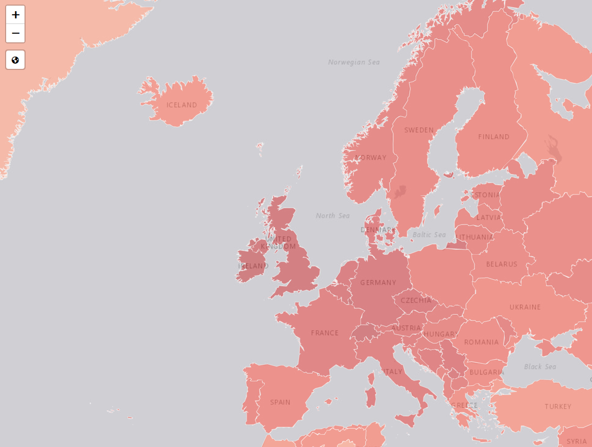
There were outliers on my countries map that were misrepresenting the data. For example, given the size of Russia, there were bound to be species that did not appear on all of its territory. So why lump them all together? So I thought I’d make a second layer to my map that has all the administrative divisions of countries, but this turned out to be harder than I expected. For example, it would be a terrible mess to try and show all the administrative divisions of Slovenia and Germany. It would just be an incoherent mess. So I opted for dividing only the big countries to bring them closer in size to the smaller ones. Many would recognize the states of the US, Australia and Canada, and the other countries I divided based on geographical features, to the best of my ability. You wouldn’t expect to see gulls in a desert, would you? But that’s exactly what you’d see if you clicked on Algeria or Saudi Arabia on my map at the time. So it had to be done.
I am not a fan of eBird’s squares on distribution maps, but now I understand why they opted for them. It was an elegant solution for water observations, disputed territories, and the fact that not all countries have convenient administrative divisions. Also, country sizes vary, and squares do not.
Region matching
Now that I had a map I was happy with, I went on a weeks-long journey to match locations of all the observations to my arbitrary borders. Needless to say, my RAM was not happy. This had to be done not only because I decided to redraw the world map, but also because there were issues in GBIF dataset. For example, observations in South Sudan would be showing up in Sudan, and many observations marked as being in Spain were actually beyond its borders — those were birds that were tagged in Spain, but observed elsewhere.
This was not the only problem with GBIF. Remember Artamus leucoryn that I manually fixed before? It was the same typo in GBIF 😂 it messed up all my calculations and I had to start anew when I noticed that a very obviously ubiquitous bird received “Extremely Scarce” treatment from my rarity-calculating function. Also, there were many species that were named differently, or considered merely subspecies by GBIF (in contrast to HBW/BirdLife). I had to take care of all of that semi-manually, adding synonyms to my bird list along the way, or deleting species from the list as they had no observations. Moreover, some species’ columns were incorrect. For example, Cyornis stresemanni/Eumyias stresemanni is under the species Rhinomyias oscillans, and the only way to get the data for this newly-split species is to search for it in a completely different column, including authority. This is far from the only hurdle that I’ve encountered with GBIF, but it’s a magnificent resource nonetheless and I wish I had learned about it sooner.
Analysis
There is a huge variance in sampling effort with such a dataset. For example, California has as many bird observations as Texas and New York State, combined. At the same time, Syria and Yemen rank among the lowest in terms of bird observations, understandably. It does not mean that there are more bird species in California. In general, the wealthier and more stable a region is, the more likely people have the time, interest and resources for observing and recording their encounters with birds (duh). Therefore, I used weighted normalization to account for variance in sampling effort and assign relative abundance to birds. Similarly, I calculated rarity for each bird, taking into account only the regions where the bird appears, so as not to have skewed results. As a result, I was very happy with my distribution maps. I believe that in some ways they are more true to life than those on eBird.
Conclusions?
I have learned a great deal about R, Shiny, birds, data analysis, and even geography. There’s plenty of curious facts that I’ve learned along the way, and many more things that I will still discover as I navigate through my app.
And the conclusions that I made in regards to the questions I had in the bird park? Sumatran Laughingthrush. That’s the bird that I should have spent more time on. There are no records of it anywhere. Ever. I cannot make a distribution map for it or even simply add it as a wild bird of Indonesia. We don’t know if it’s still out there in the mountains or not. So that’s the bird I should taken a good look at, and taken a hell of a lot more pictures.
As concerns my experience with building such a complex Shiny app, I am not yet ready to talk about it. I think I might have to go through therapy first. 😂